
Empowering self-represented litigants with intuitive legal tools.

August - December 2024 | 15 Weeks
CONTEXT
Making Legal Help Accessible to Everyone
U Do It Legal is a platform designed to help self-represented litigants (SRLs) navigate the legal system without the need for an attorney. The platform offers resources, quizzes to determine legal eligibility, and guides to simplify legal processes.
The Goal:
Our team’s mission was to revamp the platform to make it easier to navigate, more accessible, and user-friendly for people with no legal background. We worked in sub-teams to streamline the user journey, starting from the website and guiding users through quizzes to tailored process guides.
My sub-team’s main focus was the website.
PROBLEM
Legal navigation is overwhelming for non-experts
Legal navigation is overwhelming for non-experts.
The original platform had significant issues:
Confusing navigation led to users feeling lost.
Overly complex language alienated non-legal users.
A lack of clear structure made it hard to complete tasks confidently.
ITERATIVE REDESIGN PROCESS
Tackling the Website's Core Elements First
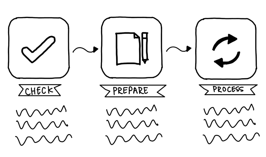
We began by focusing on the largest and most critical feature: the "Check, Prepare, Process" flow. This three-step process serves as the backbone of the website, guiding users from initial navigation to eligibility quizzes and process guides. High-fidelity prototypes were developed to refine this flow, ensuring it was intuitive and visually cohesive.
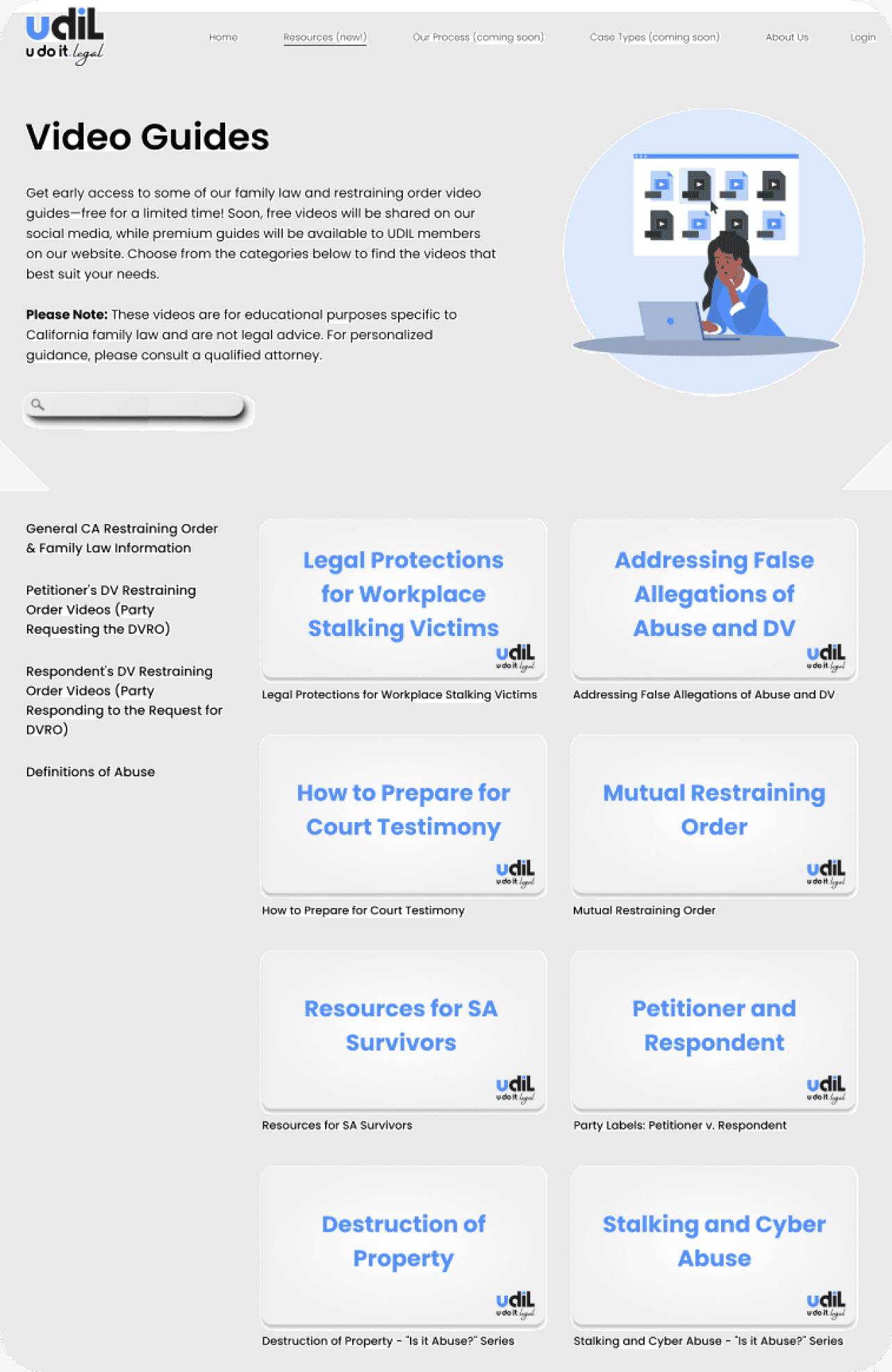
Simultaneously, we redesigned the Video Guides page, which was critical for user engagement. The page initially overwhelmed users with long, unstructured lists and unclear interactive elements. High-fidelity prototypes introduced separate sections for each video, improved navigation, and added clear labels, ensuring users could easily access and understand the content.
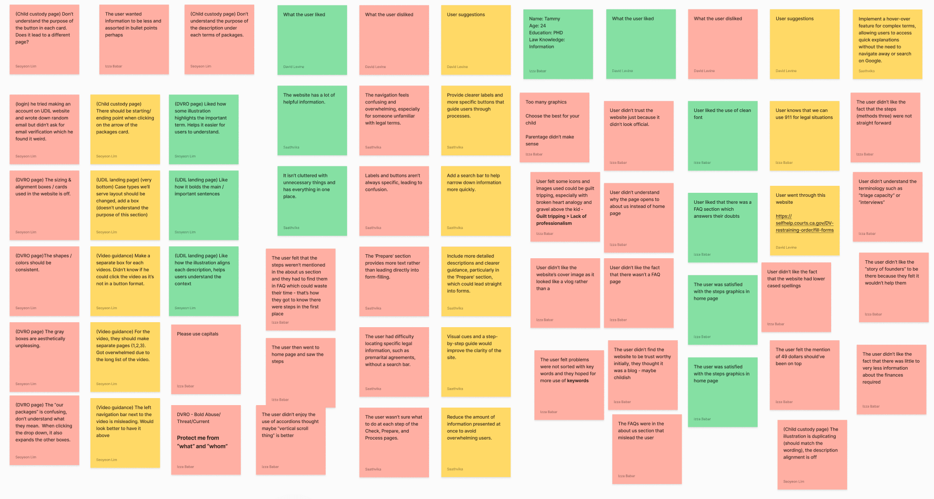
AUDITS
Pinpointing and Categorizing Improvements Across Every Page
To ensure actionable recommendations for a user-friendly platform, we conducted an in-depth audit of every page on the U Do It Legal website. Each page was thoroughly analyzed, with annotated screenshots highlighting specific areas needing improvement. These issues were grouped into three core categories:
Actionable Solutions:
Content: Simplify language, reduce redundancy, and include hover-over explanations for complex terms.
Design: Standardize alignment and color schemes, reduce unnecessary graphics, and ensure balanced layouts for clarity.
Navigation: Introduce a search bar, clarify button labels, and streamline page layouts for a more intuitive user journey.
Redundant or unclear terminology (e.g., "triage capacity").
Lack of bullet-point summaries, making content harder to scan and understand.
Insufficient explanations for legal terms like "Contested" and "Uncontested."
Inconsistent alignment and color schemes created visual clutter (e.g., DVRO page).
Overuse of graphics overwhelmed users and distracted from critical information.
Icons were visually distracting or lacked prominence where necessary.
Buttons and labels lacked clarity, leaving users unsure of their next steps.
Scattered page layouts made key information, such as FAQs and forms, difficult to locate.
USABILITY TESTING ROUND - 1
Understanding User Needs
To inform our redesign, we conducted usability testing and interviews to uncover key pain points:
Tammy, a 24-year-old PhD student, noted:
This feedback reflected broader user concerns, including confusion about button functionality, inconsistent terminology, and a lack of intuitive navigation.
APPROACH
Streamlining the user journey, one step at a time
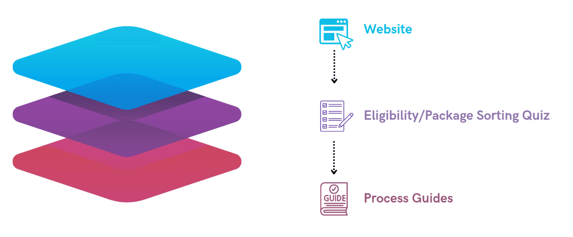
We reimagined the platform through three different touchpoints to ensure a smooth experience for users:
Website: Acts as the first touchpoint, introducing users to the "Check, Prepare, Process" flow. It provides access to FAQs, videos, and other key resources while seamlessly guiding users to the Eligibility Quizzes to take the next step.
Eligibility Quizzes: Checks users' eligibility and helps them find the best legal package tailored to their needs through simple, step-by-step questions.
Process Guides: Provides clear, detailed instructions for completing legal tasks, ensuring users feel supported and confident throughout.
"I couldn’t tell where the navigation buttons led or what purpose they served."
User Suggestions:
Add hover-over explanations for legal terms to simplify understanding.
Create clearer labels and buttons to guide users through steps.
Incorporate a search bar for faster access to specific legal topics.
Challenges Identified:
Confusing navigation, such as mismatched labels and unclear CTAs.
Overwhelming content that lacked bullet-point organization.
Visual designs that felt untrustworthy or unprofessional.


BEFORE
AFTER
CONTENT
DESIGN
NAVIGATION


EXAMPLE
EXAMPLE
EXAMPLE

USABILITY TESTING ROUND - 2
Validating Our Redesign
The second phase of usability testing aimed to validate the effectiveness of the redesign and measure its impact on user engagement and comprehension. By conducting extensive feedback sessions with SRLs, we identified areas of success and further opportunities for improvement.
To gauge the impact of the redesign, we used a 5-point Likert scale for four key areas:
Call to Action (CTA): Evaluating how effectively the buttons prompted users to take the next step.
Structured Representation of Legal (SRL): Assessing the clarity of legal information and processes presented.
Visuals: Measuring how the design aided users' understanding of legal content.
Three-Step Process: Determining how intuitive and helpful the redesigned "Check, Prepare, Process" flow was.
Results
REFLECTION
Lessons Learned
This project emphasized the value of iterative design, user feedback, and accessibility. As part of the website team, I focused on enhancing navigation and content clarity to better support SRLs in their legal journeys. Small but impactful changes, like clearer CTAs and progress indicators, significantly improved the user experience.
NEXT STEPS
Moving Forward...
To continue this project, the focus would shift to implementing the recommended changes from usability testing and audits. This includes refining navigation, enhancing content clarity, and optimizing the platform’s overall usability.
Key priorities would include:
Navigation: Streamline paths by integrating a breadcrumb trail and improving button consistency.
Content: Further simplify language, expand hover-over explanations, and add multilingual support.
User Testing: Conduct follow-up testing to validate changes and gather insights for future refinements.
These steps ensure the platform evolves in alignment with user needs, delivering a seamless and accessible experience for all users.


“The updated visuals look polished and match the brand's tone well. Buttons like 'Learn More' are prominent and guide users effectively.”
“The story line makes sense compared to the older version because now I know what’s actually happening.”
“I believe the information is well settled in the three-step process, but the icons can be improved.”
UX Designer for Website Platform